Why Does Your Opt-In Page Hide A Costly Secret?
You already did the work: you wrote the offer, built the page, found some traffic. Then almost nobody signs up, and you cannot work out why.
It is rarely the offer. It is rarely the headline either, though that is usually the first thing people rewrite.
More often than not, the page itself is quietly arguing with you. A button here, a link there, a menu bar nobody switched off. Each one feels harmless on its own. Together, they give a visitor one more reason to leave without doing the one thing you need: signing up.
I spend a fair amount of my working week inside our own subscriber database, sorting out opt-in details and correcting the odd typo. I watch where people really come from. Patterns show up fast when you are the one tidying the mess afterwards. And one pattern, in particular, shows up again and again.
The Page Is Not Confusing, It Is Crowded
I think there is a difference between a page that is badly written and a page that is simply asking too much of someone.
A visitor lands on your opt-in page with one question already in mind. Should I give this person my email address or not. That is the whole decision.
Then the page hands them four more things to think about at the same time. A link to a paid course. A row of social icons. A full menu across the top, still switched on because nobody thought to remove it.
None of those extra links are wrong, exactly. But every one of them pulls a small amount of attention away from the single box and button that matter most.
A visitor who is not confused signs up more often, and stays longer once they do.
Psychologists call this the paradox of choice. The more options you give someone, the less likely they are to choose any of them. I have watched it play out on our own pages more than once, long before I ever had a name for it.
Where This Shows Up Most Often
You can find it on a page offering a free checklist. You can find it on a page collecting names for a weekly email. You can find it on a page selling a full course.
The product changes. The mistake underneath it tends not to.
I have been reading through other articles I have shared recently, and this exact habit keeps resurfacing in different forms. It is one of those small, unglamorous things that quietly costs far more than it should.
Here is the version I see most. A sign-up page with a clear headline, a decent offer… and then five separate things competing for the click underneath it. A visitor arrives ready to say yes, and leaves instead, simply because nobody told their attention where to go.
A Five Minute Check Worth Running Today
Open your own opt-in page in a new tab. Count every clickable thing on it. Buttons, links, icons, menu items, all of it.
Does this help someone sign up, or does it give them a reason to wander off instead?
Anything that fails that test gets removed, hidden, or pushed well below the main button. Not out of habit. On purpose.
Your page needs exactly one primary action. The sign-up itself. Nothing else should be fighting it for attention.
One headline. One short line of benefit. One box. One button that says exactly what happens next.
Then add a single sentence underneath that button, naming precisely what the visitor is about to receive and nothing else. Something as plain as this works well: you will get it by email within a few minutes, and nothing more.
That one line quietly answers a fear most people never say out loud. They worry signing up means a flood of unwanted offers. A clear, specific promise removes that worry before it can stop anyone.
If You Still Need To Ask A Question First
Sometimes a visitor needs a little more before handing over an email address. A short quiz, perhaps, or a quick set of questions.
That is fine, provided you reveal it in stages rather than laying every option out side by side. Show one screen. Ask one question. Then show the next screen only once the first has been answered.
The visitor still only ever faces one decision at a time, even inside a slightly longer path towards the same sign-up box.
Run this same check every few months, not just once. Pages quietly collect new links over time. A social icon here, a second offer there, each added with good intentions and none of them removed again.
Why This Matters More Than Another Rewrite
You can have a strong offer and a sharp headline. You can still lose most of your visitors to a page that asks too much of their attention before it asks for anything useful.
This is not really a writing problem. It is a focus problem, and focus is the one thing a crowded page cannot offer.
Fix the focus first. The words you already have will very likely start converting better the moment they are the only thing left competing for your visitor’s attention.
Every extra subscriber you gain this way costs you nothing further. You already had the traffic. You were simply losing it at the door, one crowded page at a time.
Where The List You Build Goes
None of this matters much unless the list you are building has somewhere proper to live once people join it. A tidy sign-up box is only the beginning.
Nick and I built Lazy Way To Email Riches together. It picks up more or less where this article stops: what to do with an email list once people start joining it. It shows how to turn that list into something that keeps paying you back, rather than sitting quietly in a database doing nothing.
If simplifying your opt-in page is the first repair, deciding what happens after someone signs up is the second. If you want to go further, it is worth a proper look.
Give It One Clear Door
Pick one opt-in page you already have and run the five minute check against it this week. Remove whatever is competing with the sign-up box, and leave the rest alone for now.
Give your visitors one clear door and most of them will walk through it. Give them five, and most of them will quietly walk away instead, and you will likely never know why.
Best wishes for now,
Kate
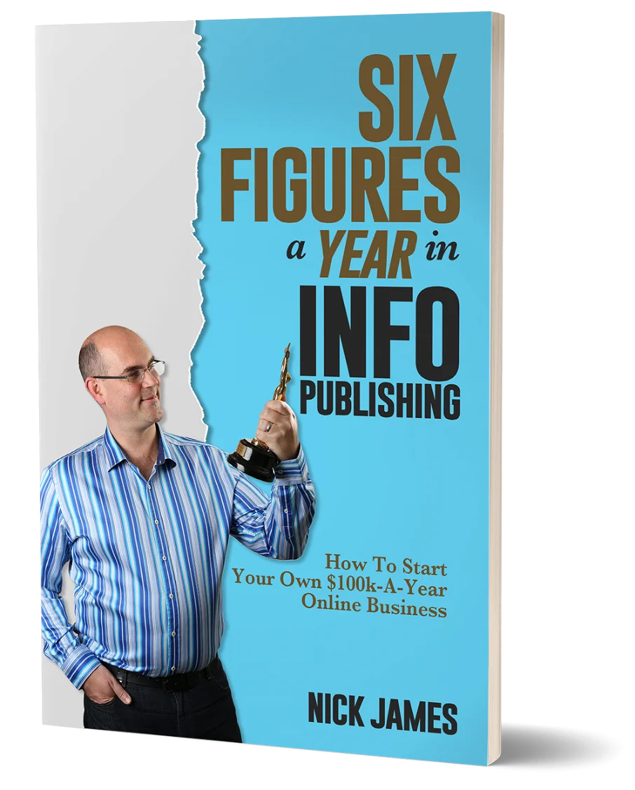
Author offers a FREE copy of this book to his next door neighbor... to prove he's not a drug dealer!
Now claim your FREE COPY.
and follow the step-by-step instructions for making the kind of money (and living the kind of lifestyle) that'll get your neighbors curtains twitching with curiosity!
Enter your details below to discover how to claim your FREE COPY of 'Six Figures A Year In Info Publishing' ...
Privacy Policy : We value your privacy. You can unsubscribe from receiving future emails with 1 click at any time.


